Google reveals new logo for mobile world
http://www.bbc.com/news/technology
 Google
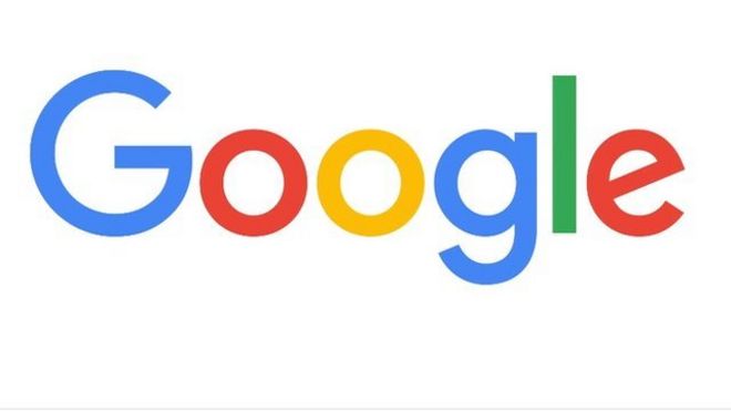
Google has unveiled a new logo for its core search services.
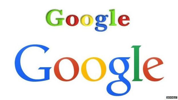
The change smoothes out some of the features in the letters that make up the well-known colourful logo spelling out its name.
It said the change was needed because people were now reaching Google on lots of mobile devices rather than just desktop computers.
The change comes after Google put its many divisions under an umbrella company called Alphabet.
It said that the logo, and its many variations, would work better on the many different-sized screens through which people used or encountered Google and its services. As well as the full logo of the company's name, it also plans to use four dots in its signature blue, red, yellow and green colours and a single, multi-coloured capital "G" to represent it.
Google announced the change on its official blog and illustrated what was different via a series of animated gifs. It said the revamped logo was "simple, uncluttered, colorful, friendly" and represented the best of Google.

It also provided a much more detailed explanation of what drove it to change the logo. One key challenge for the designers, it said, was to refine "what makes us Googley".
Google last updated its logo in September 2013.
Writing on Creative Review, Mark Sinclair said the shift was significant because before now Google had resisted doing the same as other tech companies many of which adopted a "simpler and often blander" look when they updated their official insignia.
By contrast, he said, Google had kept its "scrappier demeanour" but this latest update showed the company had indeed "smartened itself up".

No comments:
Post a Comment